Designers often start a project by developing a color scheme or a set of colors that will work well together for the sportswear. Although you’ll sometimes start from scratch, generally you’ll begin with one or two base colors that are relevant to the team or organization.
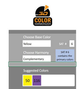
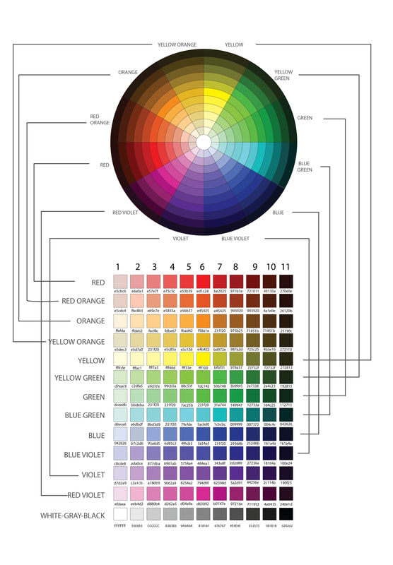
The 3D Color Harmonizer is a square representation of the color wheel. It can suggest color combinations for base and acccent colors by just choosing one color you prefer. It assures you that the sportswear you will design will be pleasing to the eye and look elegant.
There are 3 steps to follow:
1) Choose the Base Color (from Red to Red-Violet)
2) Choose the Shade and Tint Number - SAT # (from 1 to 11; the higher the value, the darker it becomes; #6 is where the primary colors are located)
3) Choose the Harmony (choose one of the 6 harmonies; read explanation below)
The 3D Color Harmonizer is constructed based on the principles of the color wheel harmonies. It is presented in square palette for easy referencing with 3DWEAR Designer.
Your base color is usually the biggest colored panel of your apparel. It is usually the color that represents the team or the organization.
Your accent can be one or two or three colors that you use to match the base color. This is a bit trickier than choosing your base color because there are more restrictions. Aside from matching a brand personality trait, your accent color must also pair harmoniously with your base color. You should not just pick out a color from nowhere. To choose the accent color, you must follow the 6 basic color harmonies. The Color Harmonizer will help you do it.
STEP 1
cHOOSE YOUR BASE COLOR
Your base color is usually the biggest colored panel of your apparel. It is usually the color that represents the team or the organization.
STEP 2
CHOOSE YOUR ACCENT COLOR
Your accent can be one or two or three colors that you use to match the base color. This is a bit trickier than choosing your base color because there are more restrictions. Aside from matching a brand personality trait, your accent color must also pair harmoniously with your base color. You should not just pick out a color from nowhere. To choose the accent color, you must follow the 6 basic color harmonies. The Color Harmonizer will help you do it.
6 BASIC COLOR HARMONIES
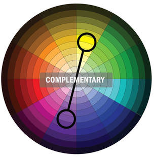
For example, If you choose COMPLEMENTARY, the accent must be the color directly opposite the base color. Let's say, you chose violet as the base color, the accent can be yellow. See diagram below.
The Color Harmonizer works the same way as the color wheel but it was just arranged in squares to enable easier referencing.
The Color Harmonizer works the same way as the color wheel but it was just arranged in squares to enable easier referencing.
Sample Views of Complementary Colors of Yellow and Blue Violet
CHOOSE YOUR NEUTRAL COLORS
STEP 3
More often, you don't need a neutral color. But if there are many components in your design, you may need a neutral color to fill up the gaps. If your apparel design has too many accents (say, more than 3), then, coloring the other accents with a neutral color is more preferable. Typically, the neutral colors are different hues of gray, beige, whites, off-whites, and black.
Choosing the right colors for you requires a lot of creativity and experimentation. Bear in mind that color is very psychological and different color harmonies produce different effects. For example, analogous colors are similar in hue, creating a smooth transition from one color to the next. Complementary colors are opposite to each other on the color wheel, so they create a strong contrast. Monochromatic color schemes can be subtle and sophisticated.
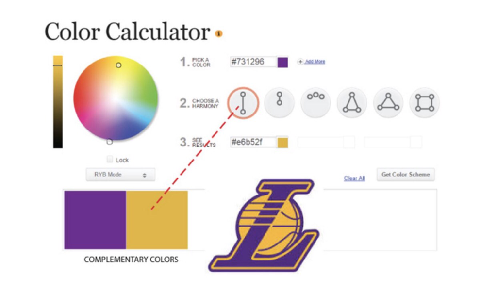
- Complementary — Color complements — or opposites — are colors directly across from one another on the color wheels. Because they’re opposites, they bring out the best in each other when paired; you see complementary colors a lot in sports teams. Complementary colors are great for dynamic, stimulating visuals, but be careful of copycatting another brand since they’re so popular. One famous basketball team using complementary colors is Lakers. The golden yellow is complemented with purple.
Take a look at the animation below. Stare at the black “+” in the middle. After a few seconds, a yellow-green circle will appear to be moving around the center. After a few more second, the red-purple circles will disappear completely leaving only a yellow-green circle moving around the center.
Now what makes this really cool is the fact that there is no yellow-green circle at all. The red-purple circles are just disappearing in a sequence. Your mind creates the yellow-green circle. Why yellow-green? Well, yellow-green is the complement of red-purple. If you take a look at the color wheel, you will see that yellow-green and red-purple are directly across from each other on the color wheel. What’s even more interesting is that this works for any complementary color scheme. For example, if you changed the red-purple circles to blue, an orange circle would appear. If you changed the red-purple circles to yellow, a purple circle would appear.
MAJORITY OF SPORTS LOGO USES COMPLEMENTARY AND SPLIT
- Triadic — The triadic color harmony is the next favorite among sports teams. A stable branding color scheme, triadic colors draw in equal parts for three different sections of the color wheel. Triadic schemes are stable like analogous themes, but offer a more stimulating variety like complementary schemes. The hardest part is getting the three colors to coincide with the traits of your brand identity.

